Coleg Menai.

An exhibition held by Coleg Menai's second year degree students. It was all up to a very high standard and was a good collection of pieces varying from a fishbowl to a poster to a set of televisions playing footage of budgies in their cages which gave you a very colourful and quirky welcome as you entered the room, at The Galeri, Caernarfon.

(apologies for the crap quality photo's- my beautiful new camera will stop this happening in the future)
There were so many exiting pieces of work that i loved, its difficult to chose favourites. But a couple of pieces did steal my attention due to the detail and scale, Mel Cunninghams work all looked fantastic, some framed and one being a large circle piece that could have worked just as well in the room if it was empty. They were a collection of dry point etchings, the main one being her own re-creation of the last supper. The detail was immense of the characters and background in the piece, as well as the blue colour giving the monotone piece a moder outburst of colour, also worked well alongside some of her less busy pieces.
Eva Hoyle's piece 'She' was also one of my preferred pieces. A delicate collection of framed neutral paintings/ ink of a woman figure.
The exhibition also had a large sculpture piece by Miguel of the standing figure. He produces work inspired by the human body and uses his experience of living with partial hearing as motivation to produce deep pieces, varying from ceramics to this plaster combination sculpture.
As a whole, it was a very successful and refreshing collection of work, and reminded me again of the high standard Coleg Menai students continue to reach. The work was ambitious and professional. I thurely enjoyed viewing high quality art as close to home.


 I came across the artist Fiona banner, i recognised her name, she was short listed for a turner prize and her piece 'war porn' reminded me of the effect i was aiming for with the writing within my work. Her work varies with experimenting with words,letters,sentences and film transcripts and military aircraft inserted within instillation's. I was instantly drawn to the hand writing, the kind of clumsiness behind the letter and the labour evidence behind the words. It made the piece very personal.
  Where as her pieces with stenciled letters are more structured but still affective.
 I finally finished my first version of the recent idea i had of combining the information i received off a person with an image of their feet and that through combining photography and stitching. I was missing a bit of crafty work within my project so going back to the sewing machine was refreshing as well as a challenge as I've never used a sewing machine to sew words before-especially a whole a4 image of words. It was a long process and took allot more of my time than i originally assumed it would, but now at least i'm prepared to the days that goes into producing of of these for feature reference.
 I love the way the black and white image contrast with the bright pink. I would like to experiment more with layering different colours of writing next but in a similar manor to this one as i feel it has turned out well and how i wanted it. I'm hoping these could build up to being a sucesful series of work, although very time consuming. Im happy to be producing real life pieces as well as the insole blog as i found being on a computer and collecting images of shoes a bit tedious.And i enjoy making more than photoshop-ing and i find it easyer to enjoy my work more when i have put hours into producing something.... hoping that other people can aprechiate the effort too.!!!


 I started thinking about other paths i can take but sticking to the theme of shoes or feet. I liked the idea that someones identity could be through a different part of their body except their face or personality. The shapes on the bottom of shoes also amuse me and i would like to make something out of them too.


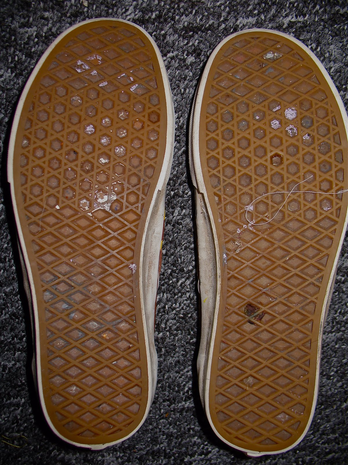
 Here are some of the shoe sole pictures i have received by people. i also did receive information about the shoes - where they origionated from, what their main purpose was and wher had they been, but ive not yet decided how to use that information within the wok.
 As I've decided to create a blog of some sort will a collection of images of insoles that i will collect from people, i thought it would be important to try and produce one as professionally as i could. That meant coming up with some sort of name for the blog so it could represent some sort of 'logo' for the project.
 My two favourite were 'discover my sole' and 'share your sole' as i thought they seemed to explain the purpose being the project quite clearly as well as being catchy am memorable. I also experimented on photoshop with different backgrounds and colour, keeping it simple and trying out different layouts.

 Elan.
Elan.


